Plastic Oceans

Key Concepts
Interviews, Use Cases, Information Architecture, Sketching, Paper Prototyping, React Development, Testing, Support, & Presentation Session
Group Members
Alexis Koss, Jane Quichocho, Vanessa Hsu, & Lisa Koss
Date
4 months
Instructor
Andrew Begel
Tools & Frameworks
React.js, jQuery, Firebase, Bootstrap, Material UI, D3, CSS & Fetch API
Role
UX Designer & Developer
Overview
I worked as a UX designer and developer on a mobile responsive website called Plastic Oceans. Plastic pollution is a chronic problem across the entire globe, but many people are unaware of how their own plastic usage affects the world around them. Plastic Oceans is an interactive mobile website that users can use anywhere on the go to help educate themselves about plastic pollution. By incorporating interactive elements, users can learn more about the planet and just how dire the situation to see what they can do to help reduce their own plastic footprint, no matter what a user's lifestyle is like.
Mission Statement
To bring awareness to the overuse of plastic that is endangering our oceans as a way to empower individuals to take action against plastic pollution.
The Problem
Why is reducing plastic waste important?
When you think of an ocean, you think of clear, blue water with abundant marine life around. Unfortunately, every year approximately 19 billion pounds of plastic waste end up in our oceans, causing massive ocean pollution and endangerment of sea creatures. Many people are unaware of how much plastic they use and how this usage is affecting our world’s oceans. In particular, the marine life is vulnerable to unnatural deaths due to entanglement or digestion of plastic. To help mitigate this problem, our solution will educate users on the impact of their plastic footprint while giving them advice on how to reduce their own plastic waste.
User Research
Interviews
We conducted two semi-structured interviews before diving deeper into possible features for our proposed solution. We chose to target potential users who are interested in reducing their environmental footprint. We asked a few questions to gauge their interest in an educational, but interactive, application that could help them reduce their plastic waste. Here are the main points that we took away from our research:
Most are unaware of how much plastic is wasted everyday and where it goes.
Are interested in making a difference, but sometimes don't know how they can reduce their plastic waste and if they're really making a difference.
Many people don't consider the dire effects that plastic has on the world's oceans when using products with plastic.
Use Cases
At this point in the process, we thought about the different use cases that we wanted to design in order to educate our users the best that we could with our proposed application and based on the research that we just gathered. We defined the following three use cases:
Discover: Users can discover how much plastic is incorrectly disposed of along coastlines in the US to visualize the extent of plastic pollution.
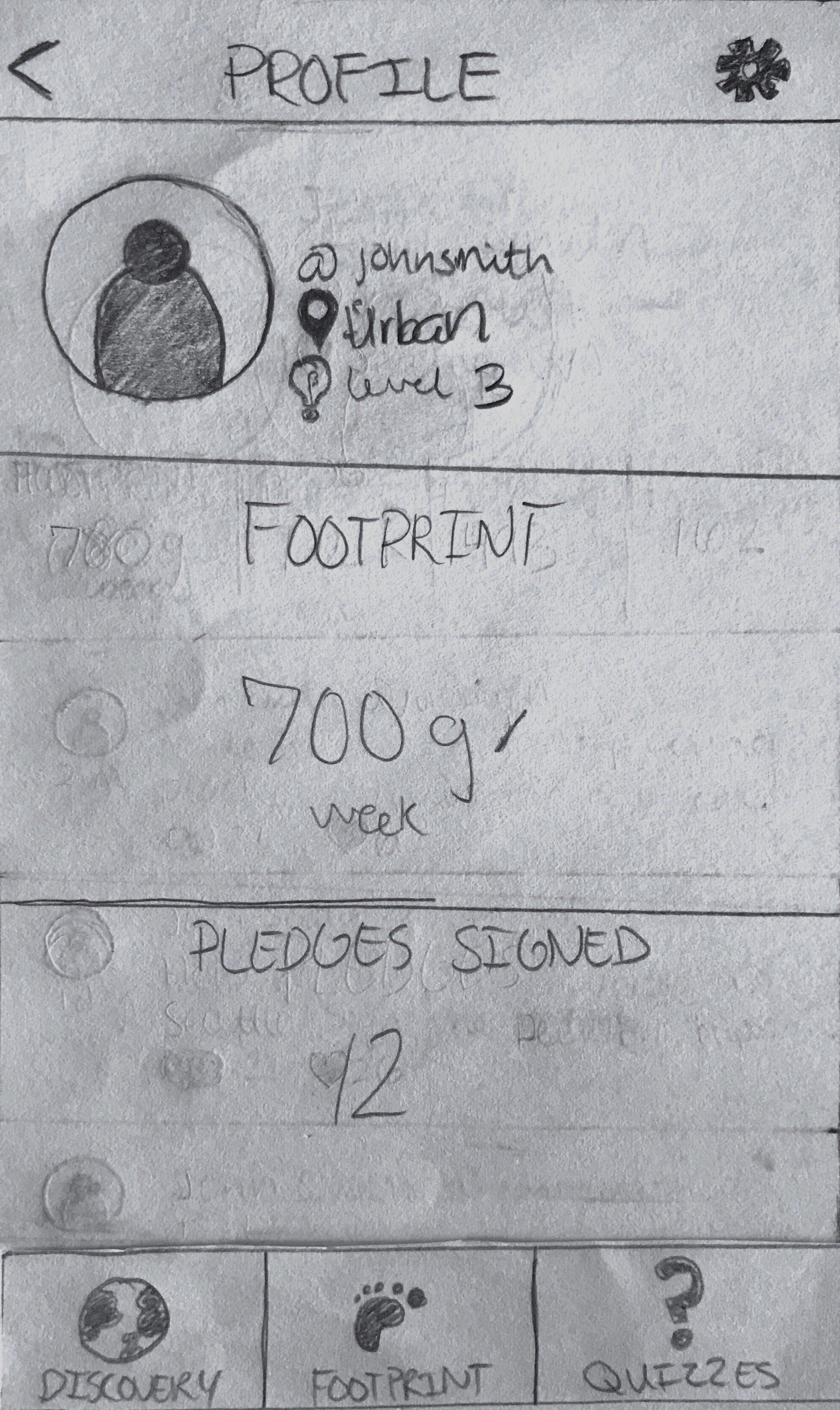
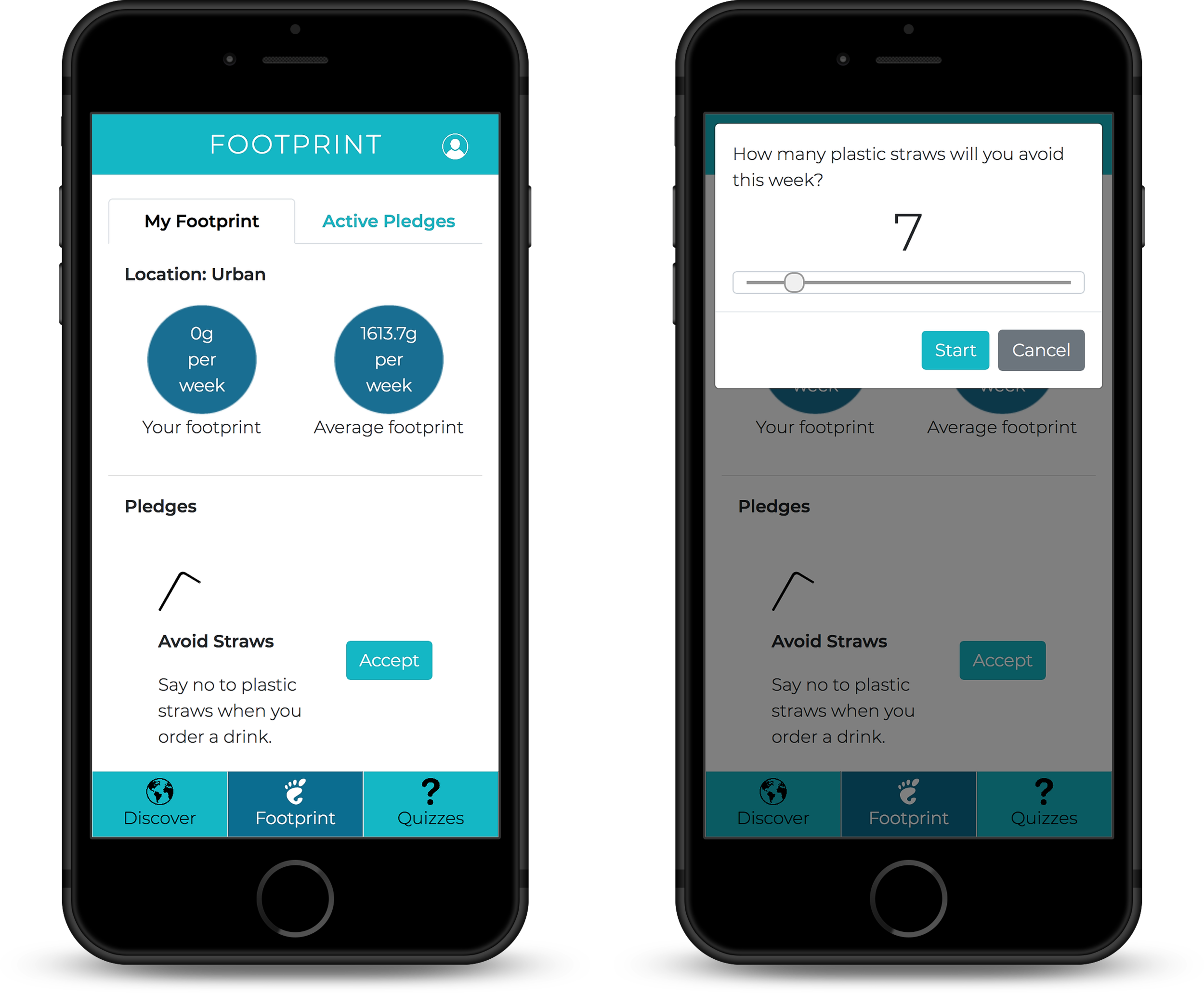
Footprint: Users can view their own plastic footprint and see what they can do, via accepting pledges, to reduce their own footprint.
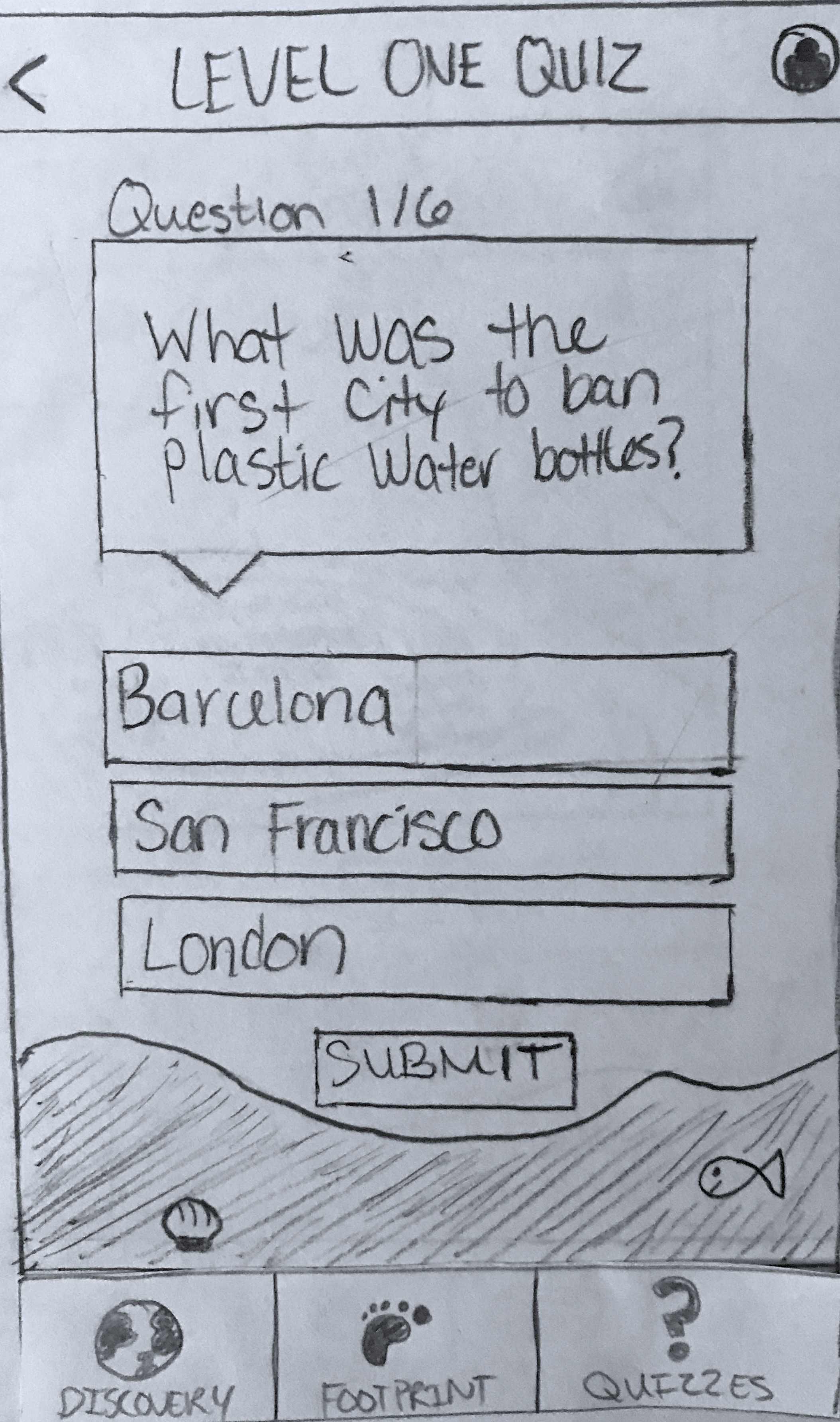
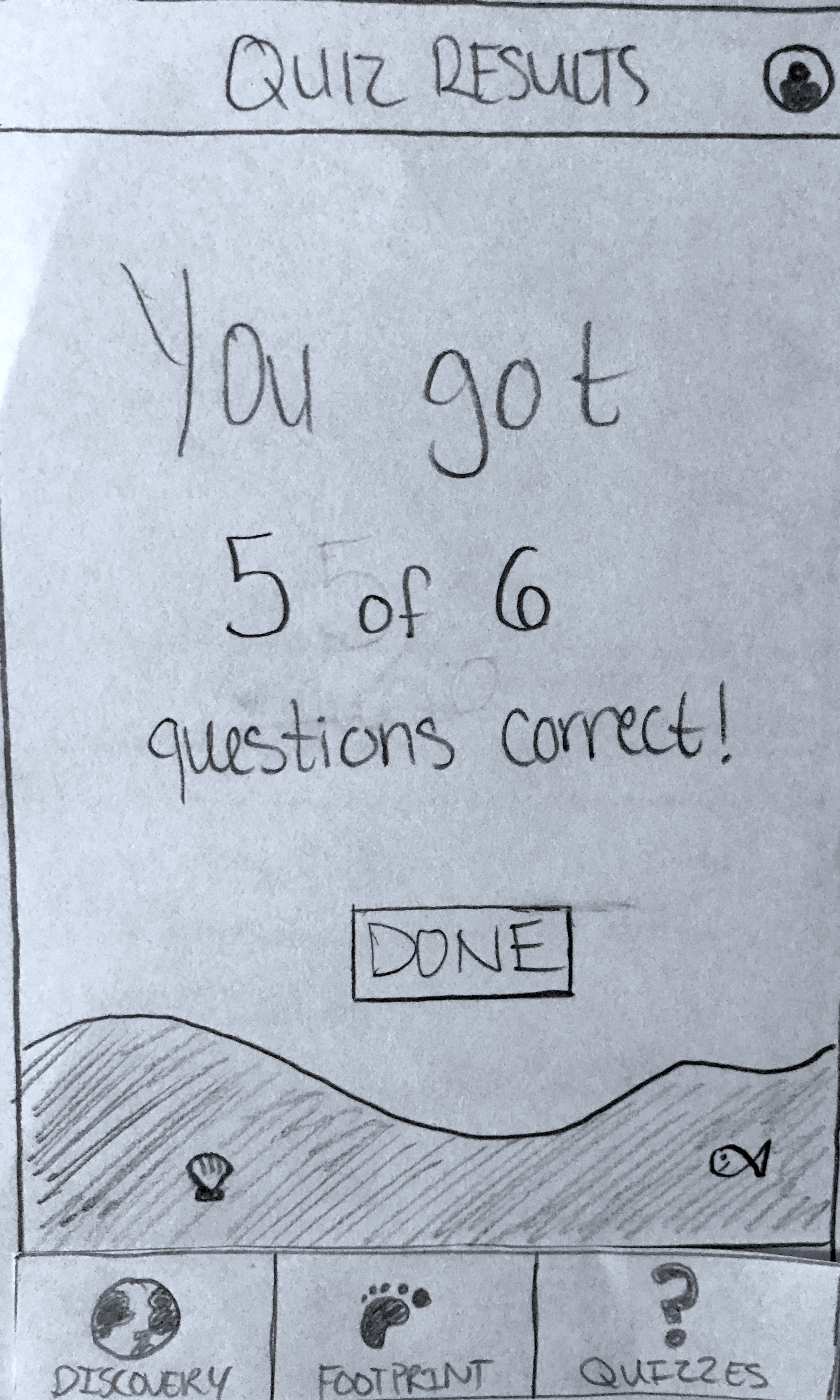
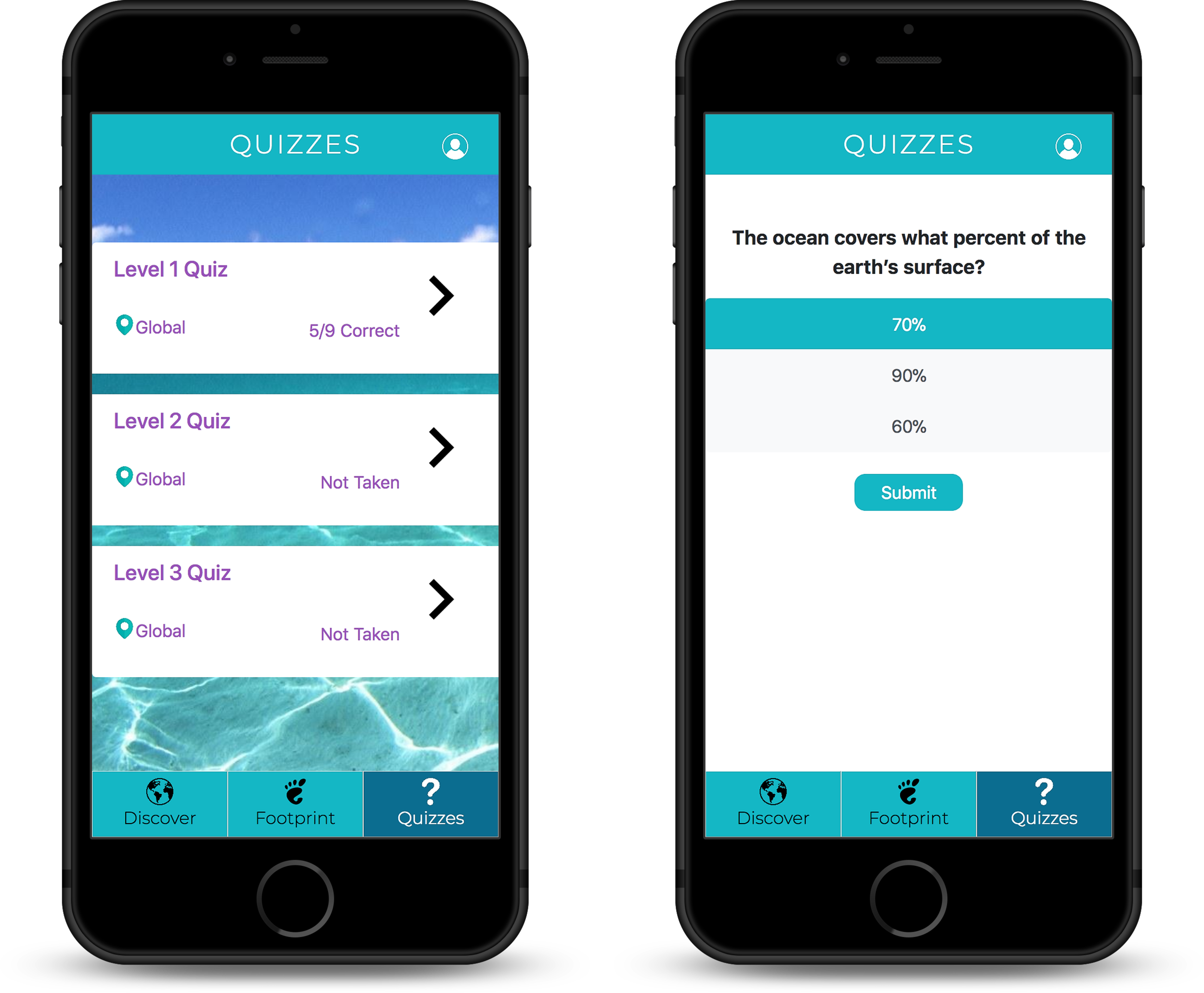
Quizzes: Users can take quizzes to test their knowledge about current plastic statistics and the efforts to reduce plastic waste, learning as they go.
Information Architecture
Following a deep exploration of our users' needs and wants, we spent time laying out the flow between the different features mentioned in our use cases. The information architecture for Plastic Oceans is simple, yet straight forward. From anywhere in the application, users will be able to access our three main features: the discover map, the user's plastic footprint, and quizzes via a toolbar for mobile rendered versions or a navigation header for desktop rendered versions.
From there, each feature only contains links to content that pertains to that section, creating a logical, well structured flow that users can sort through easily. Users will be focusing on the tasks they're trying to accomplish instead of worrying about how to navigate or use Plastic Oceans since no important navigation is hidden in unnecessary secondary menus, causing users to miss important content. By organizing Plastic Oceans' pages and overall site structure to be minimalistic and simple, users will be able to perform tasks faster with the least amount of effort possible, which in turns creates a pleasant experience for them.
Plastic Ocean's information architecture, detailing how our proposed features will interact with each other in each potential user flow.
Paper Prototype
Our team had exactly one week to design what our application would look like along with a design specification detailing our design choices behind each screen. With our information architecture in hand, we knew exactly what we needed to sketch for our paper prototype. Our goal, by the end of the sketching process, was to have a finalized paper prototype that would aid us during the next stage of development as to how the developed design should look. Myself and one other teammate were responsible for Plastic Oceans' entire design.
We went with a mobile-first design approach when designing all of the following screens so our designs focus on what a user needs to complete an action to maintain optimal functionality across all devices.
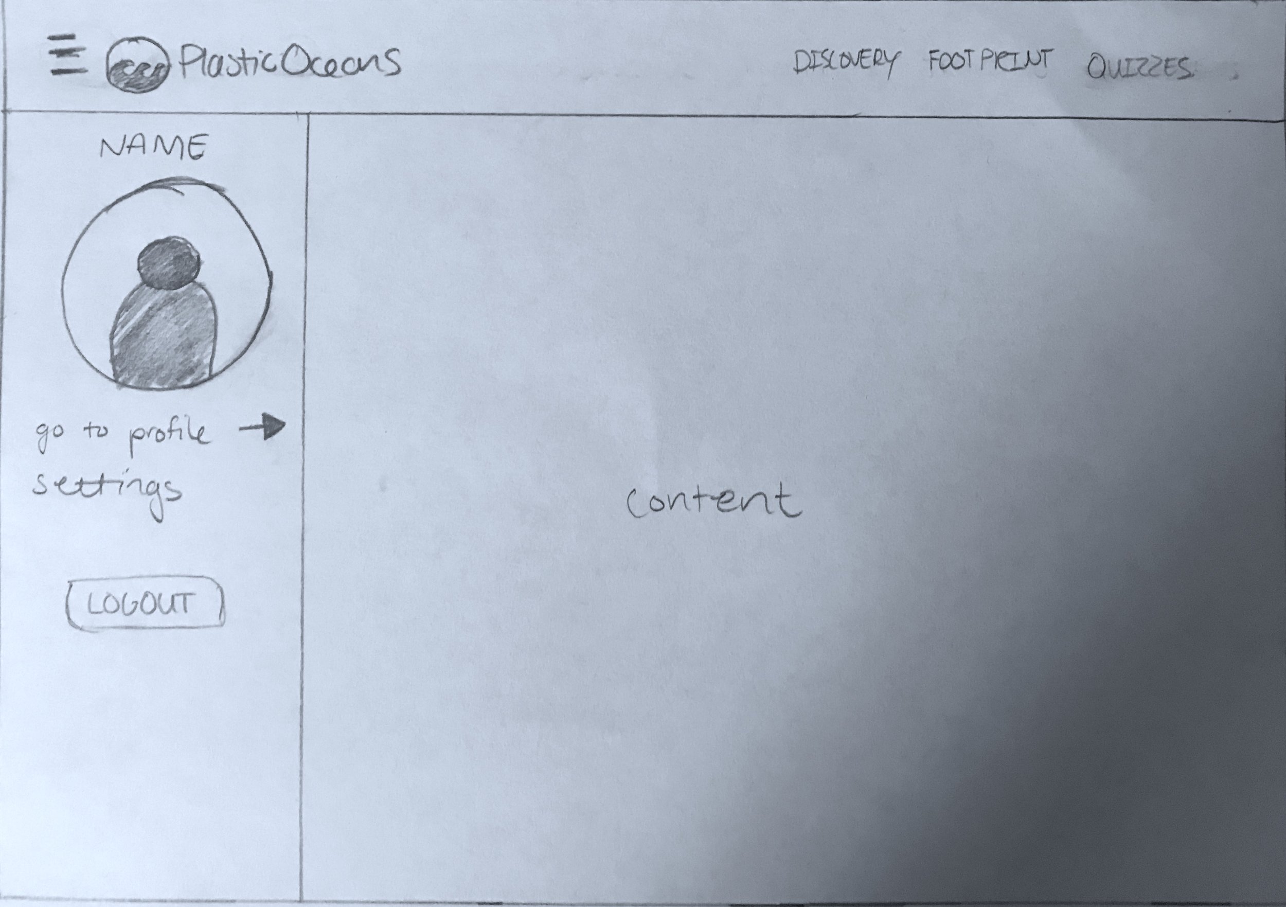
Navigation
The navigation differs for a user depending on the device that they're using. For mobile devices, users will have a top navigation bar that has its respective title, such as discover, and an avatar icon indicating a link to the user's own profile. Mobile devices will also have a bottom navigation bar with tabs to our three main components, allowing a user to quickly use their thumbs to switch between tabs.
On larger devices, such as a desktop computer, all navigation links will be in a top navigation bar along with a hamburger menu. The hamburger menu will be present for secondary navigation, such as the profile or settings, as users won't be accessing those links as often compared to the others. By using a sliding drawer, we can maximize screen space for the page's respective content by hiding rarely used links.

Discover
After logging into Plastic Oceans, users are greeted with the marine debris map. From this map, users can scroll or swipe to explore the United States to see how much trash has been collected along the coastlines. Small bubbles are placed along the coastline, alerting users of how much trash has been collected there. The map takes up the most of the screen so users have ample space to swipe in any direction.
To see more details, users can tap or click on a bubble to see the kinds of trash collected there. By putting this information into a pop-over module, users have the power to decide when they want to see a breakdown of the plastic collected in that area, alerting them of just how much plastic goes unrecycled and is inproperly disposed of.


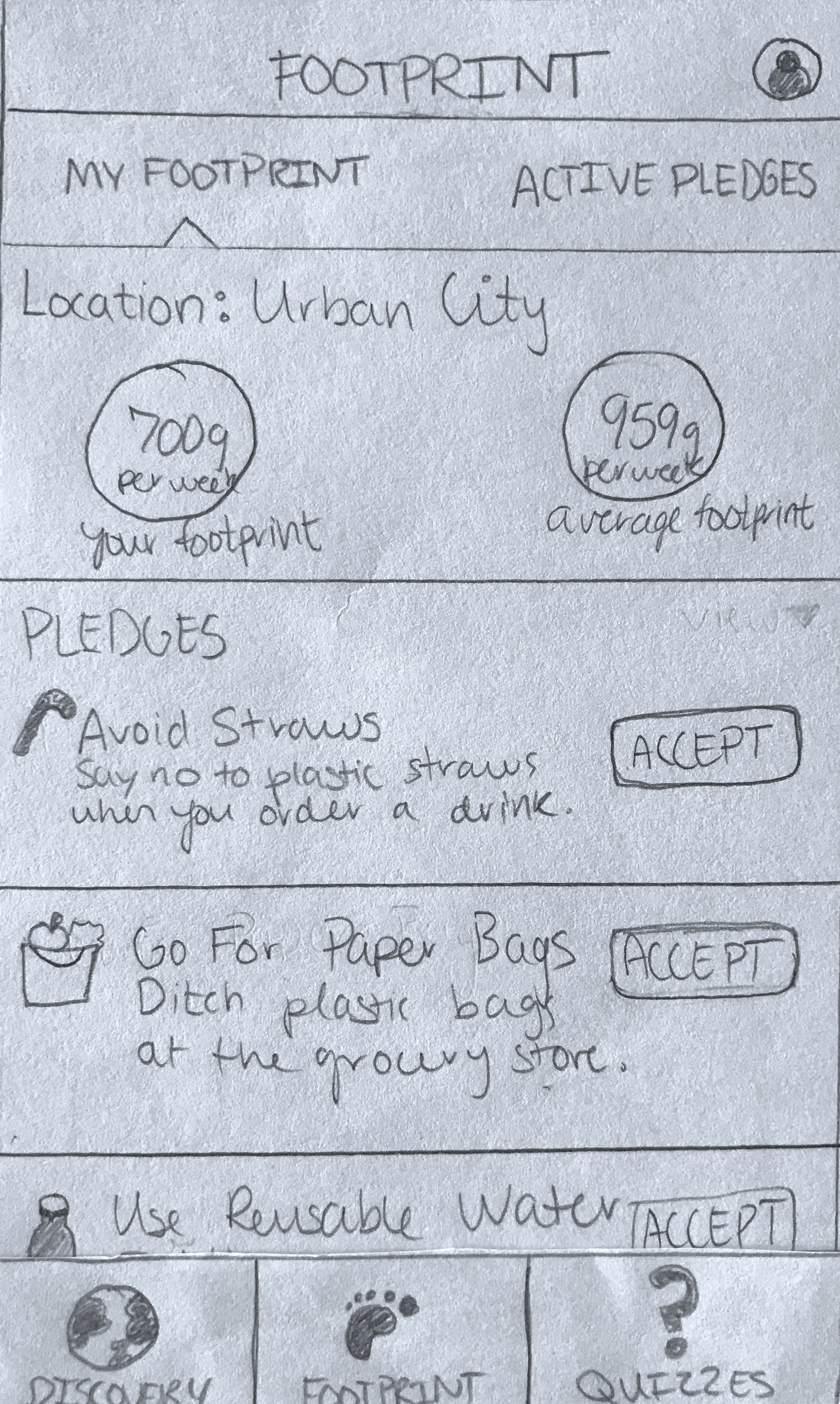
Footprint
A user can also track and explore their own plastic footprint to learn about ways they can reduce it. A user’s base footprint is calculated based on their location type (urban, suburban, or rural), which is also the average footprint for this location type. To reduce it, users can accept pledges in an effort to use less plastic or switch to plastic-free alternatives. To increase awareness, users can view the average footprint for their location type right next to their own footprint, making direct comparisons easier without the need for additional research outside of Plastic Oceans
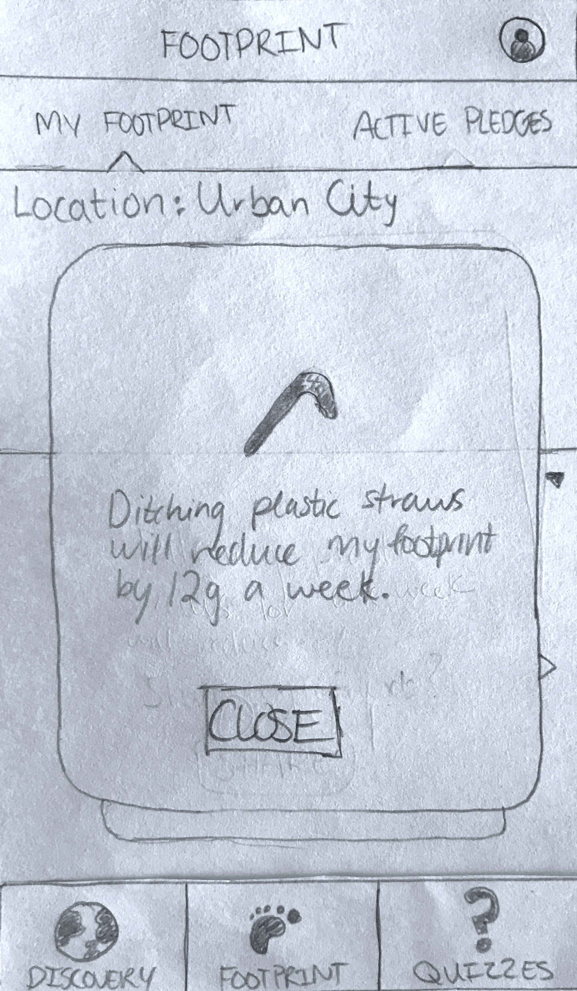
Available pledges for a user to accept are shown in a list view. A list view allows users to quickly scroll through the list to find pledges that match the lifestyle changes that they’re willing to make. When accepting a pledge, users are prompted to estimate how many of a particular plastic item they will avoid (straws for example) or how often they will switch to a plastic free alternative (such as a reusable water bottle). As soon as the pledge is started, the user is immediately told how much that pledge will reduce their footprint for the week, giving them the immediate satisfaction that their actions will make a change. Using a pop-up module in this case ensures that a user is aware of the change that they're making.
Any active pledges can be viewed in the secondary navigation tab, which allows users to remember what they pledged for the week or gives them the option to delete a pledge if they can no longer stay with it for the week.


Quizzes
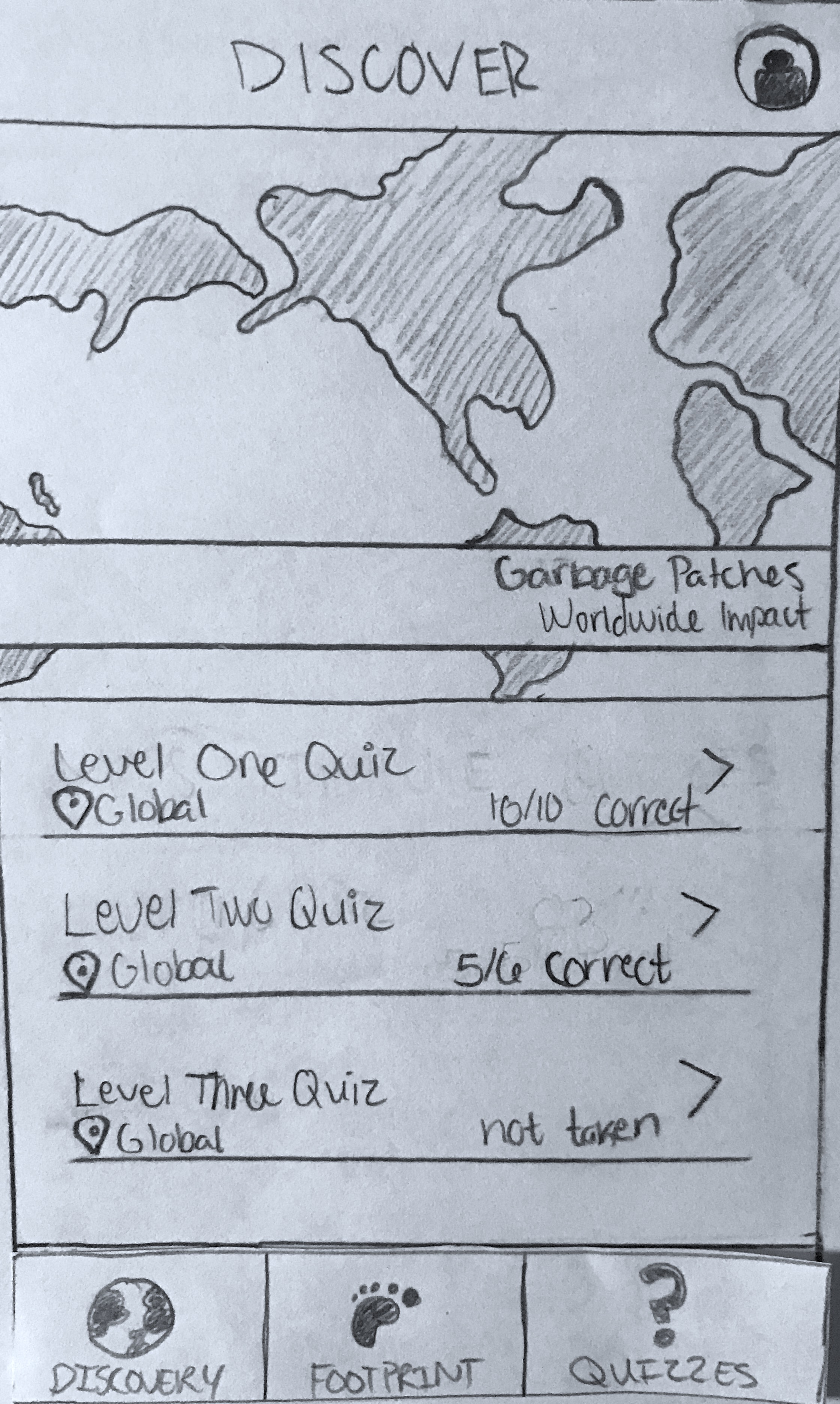
Users can visit the quizzes tab to not only test their knowledge of plastic waste, but to also educate themselves as well. Upon viewing the quizzes tab, users will see a list of quizzes, in a list view for easy navigation, that they can take. Each quiz is denoted with either a global or local scope so they know the type of questions that they might encounter.
We went the design choice of using a multiple choice format because it encourages users to take their best guess without feeling like they have to know the answer with other formats, such as short answers. By avoiding having users to enter their own, unique answer

User Profiles
To track their own progress, users can visit their profiles to see their efforts in reducing plastic waste.

Development
Following our design work, my team had the last two weeks in the quarter to develop our proposed application. Before coding anything, my team and I came up with a requirements specification that analyzes and lays out exactly how our application would function whenever a user interacts with it. By having strict and very detailed guidelines to follow, as well as a physical paper prototype, we were able to develop Plastic Oceans with little to no confusion because we knew exactly how each screen should look and respond with each interaction.
Class Requirements
As per the requirements of the project for INFO 461 (Collaborative Software Design), we could not stray from our prototype or the following requirements specification, even if it would make our application better, as those stages were finalized in our previous roles of researchers and designers. Even if we thought a new change or addition would be beneficial to the user experience, we had to forgo it or we would be penalized points. Therefore, the final, developed iteration of Plastic Oceans is almost identical to our paper prototype.
Tools
We decided to use Firebase, a no SQL database, to store all user data as well as process user authentication for account creation and user sessions. With our previous experience using Firebase for past projects, it was an optimal choice for us because it minimized introducing a new learning curve if we used a different type of database.
We also used React.js to code Plastic Oceans. Again, due to each of our previous experiences with React.js, we decided to use it so we didn't have to learn another language in such a short amount of time. Additionally, React.js is perfect for encapsulating each key part of our application into components, including the login system, discover map, footprint pledges, quizzes, and user profiles.
Home & Sign In
Plastic Oceans' splash screen is welcoming to first time users or users who need to log back in. A blue-to-purple gradient over a jellyfish background immediately immerses users, making them feel like they're at an ocean shore.
Discover
A desktop version of our discover map. Whether Plastic Oceans is viewed in mobile or desktop view, the map is shown in similar format, allowing users to tap or click on any bubbles to see more details about the trash found in that area.
Footprint

Quizzes

User Profiles

Testing & Support
After designing and developing Plastic Oceans over the course of nine weeks, we then had to test our application in preparation for a bug bash event our professor put on for the entire class. The bug bash was a 24-hour period where the entire class tested out each other's application in an attempt to find any bugs before our final releases and project presentations. To prepare for this event, my team created a verification plan that we manually tested against as we implemented each feature, which details exactly how each feature is suppose to work depending on a user's interaction with that feature. Any result that a user found that didn't follow our plan was classified as a bug.
During this 24-hour bug bash, each of us on my team had a responsibility to offer support on any issues that were opened on Github concerning bugs that a classmate of ours had found. We only had a few days to fix any bugs that were found so together as a team, we decided that we would offer support as soon as possible. If an issue was opened that wasn't a bug, one of us would post explaining the poster's misconception. Any bug that was classified as a major bug was fixed immediately because those bugs were critical in a user using a key feature in our application. Minor bugs were given less priority because they didn't interfere with a user completing an interaction successfully so they could be fixed a few hours after being reported.
FURTHER Development
Plastic Oceans was an interesting and fun project to work on over the course of ten weeks. I took on many different roles throughout this process, from designer to developer and then finally a tester who provided support when needed.