Up Beet

Key Concepts
Interviews, Sketching, Paper Prototyping, Wireframing, Usability Testing, High-Fi Mockups, & Video Editing
Group Members
Lisa Koss
Date
4 months
Instructor
Jason Yip
Tools
Illustrator, Adobe XD, & Powtoon
Role
UX Designer
Overview
I worked as a UX designer on a mobile application called Up Beet, which helps grocery shoppers find the best deals to maximize their weekly savings. The application features a convenient way for shoppers to browse weekly ads, create shopping lists, compare prices for items across multiple grocery stores, and can send notifications for when items go on sale or even when the user walks by an item that they have in their favorites.
Grocery shopping can sometimes be overwhelming with cluttered ads to sort through that often cater to big name brands. Up Beet aims to reduce the impact of this problem by not only reminding users of when their favorite items are on sale every week, but by also giving them the ability to compare prices at their fingertips. Our application easily allows users to determine what and where the best deal is that week.
Our final product won awards for Best Visuals and Overall Picture during our final presentation session for INFO 360.
The Problem
Saving money is a high priority for many people, especially for university students who are already on a tight budget while they are away at school. However, many shoppers who regularly visit the grocery store once a week often don't look at the weekly sales ad before grabbing the items on their list, potentially missing out on money saving opportunities.
According to a recent study, the "big sales" advertised every week aren't really sales because they usually don't have a significant reduction in price. This causes grocery shoppers to miss out on money savings opportunities for other items that are on their shopping lists because they don't clear way to find deals and compare prices.
User Research
Interviews
To gain more insight about the problem we identified and the needs of university students, we conducted a two semi-structured interviews with University of Washington students to help gather a basic understand of people's grocery shopping habits. We chose to target university students since they are often live on a budget and would be easily accessible for interviews when we needed them. We discovered three main points we took away from our research:
Typical grocery store ads are too time consuming to look at with the potential of finding nothing on sale that the user wants
Users don't usually check the sale prices of items unless they're already in the aisle looking for a particular type of item
On-sale prices can sway a user's decision to buy an item when they wouldn't have before
Personas
With this information in hand, we were able to think deeply about our users' goals, pain points, and wants. We decided to look more into a typical college student who would be interested in using our application as well as looking into a user group we didn't get the chance to interview, a young mother who might be on a similar budget to a college student. We concluded that potential users might:
Be busy with their everyday lives
Live on a tight budge
Want to save money and time
Want the best deal for every dollar they spend
Be comfortable using technology to help shop and find deals for groceries
You can view our personas, Sally and Shane, below.
Sally is a new mother who is always looking for ways to save money while out shopping for her family.
Shane is a young college student who wants to eat better, but while sticking to his budget too.
Information Architecture
After exploring our users' needs and wants, we then brainstormed and defined the features that our users would find helpful. We knew that our users would need a quick way to compare prices of items their favorite stores at while also being able to add those items to lists they could keep track of. With the addition of a search tool as well as being able to quickly look through a store's weekly deals, users can maximize their savings and time with minimal effort.
We mapped out the information architecture to ensure our features were organized in such a way where every tool and feature is easily accessible to minimize user frustration. As a result, we were able to map out interactions that we thought would be the most beneficial for our user when they're trying to accomplish a task quickly before heading to the store.
The information architecture of Up Beet and how we intended to organize our features.
Paper Prototype
Following the creation of our information architecture, we made a paper prototype to test with potential users. Our paper prototype only included a few core features to test how our potential audience responds to our proposed features and application overall.
Through the use of paper prototyping, we were able to quickly put our ideas down on paper and focus on how our product flows overall without paying attention to minor details such as icons. This is also the first time that we started to incorporate some visual design into our product, which is an important step because we were able to get feedback on placement of specific elements to help refine our user interactions as they navigated our proposed interface.
During our first round of usability testing, we tested our low-fidelity paper prototype with six users. The following explains what tasks we asked our users to accomplish along with the initial feedback that they gave us.
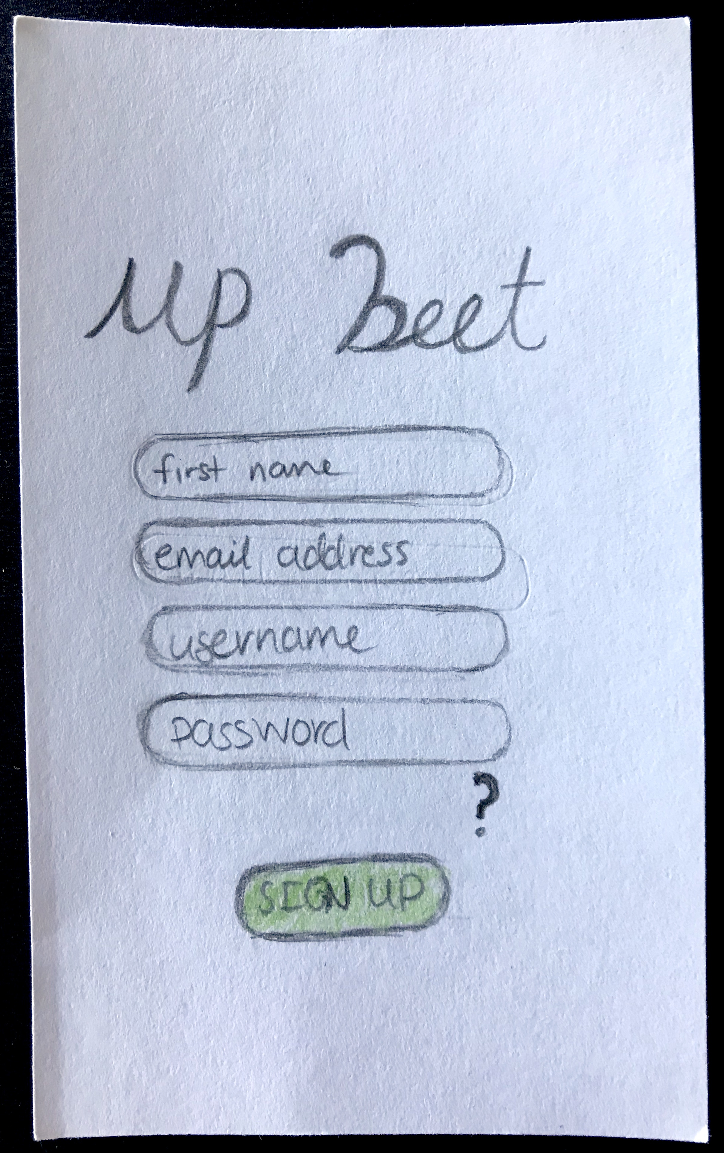
First Task
The first task we asked users to accomplish was to sign up with our application and then login once they had done so. Our users found this task to be quite easy, although they had some confusions with what the question mark icon that appears below the sign up form means and some users wondered why they didn't have to confirm their password.


Second Task
For the next task, we asked users to choose their favorite stores upon their first log in (first screen below). Some users were initially confused as to why they were accomplishing this task because there was no on-boarding present to instruct them as to why they were doing this, but later on they figured out why. Users liked the large icons to indicate each store.
We also asked users, as soon as they completed the sign up process, to navigate to where they thought they could sign out of our application. All users successfully found the sign out button in the hamburger menu drawer, indicating that users almost always expect the sign out button to appear in a secondary menu.


Third Task
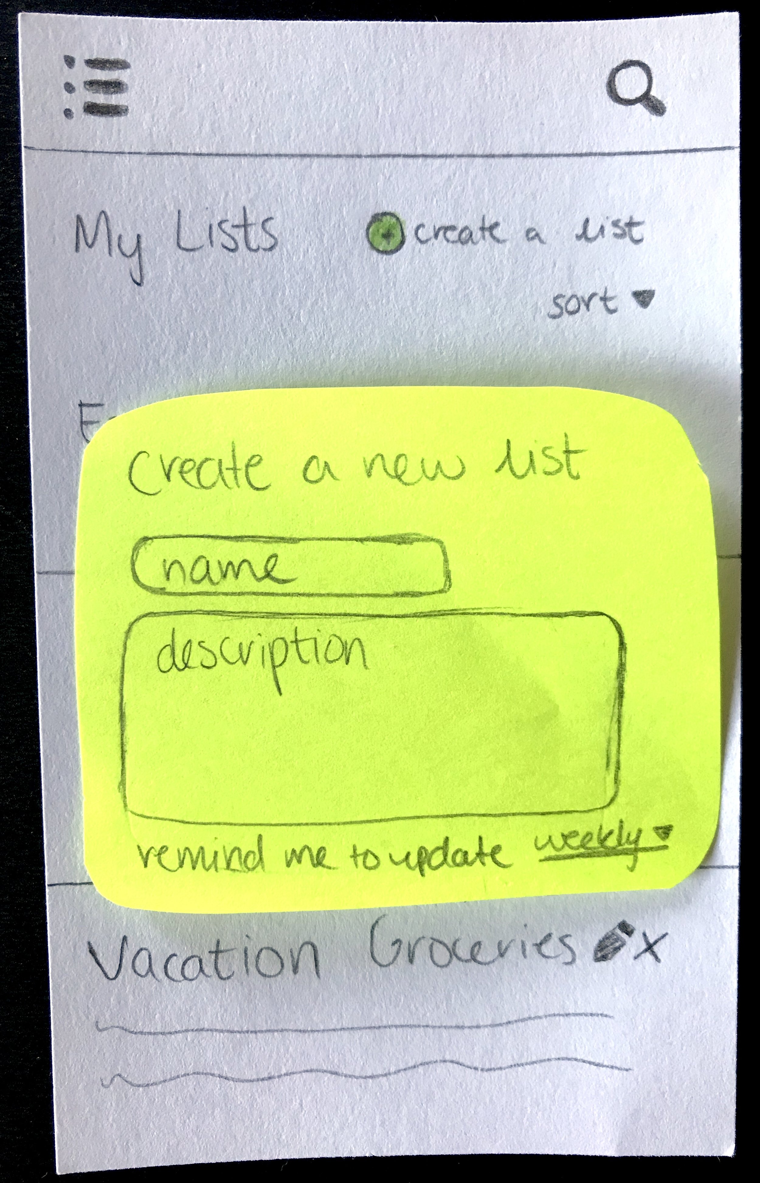
The third task that we asked users to complete was to create a new grocery list. Users generally had no problem with this part of the usability testing because the create a list button was clear due to the green color. Although, many users were confused with the pencil and x icons meant when they first saw them and weren't sure what they would do.

Fourth Task
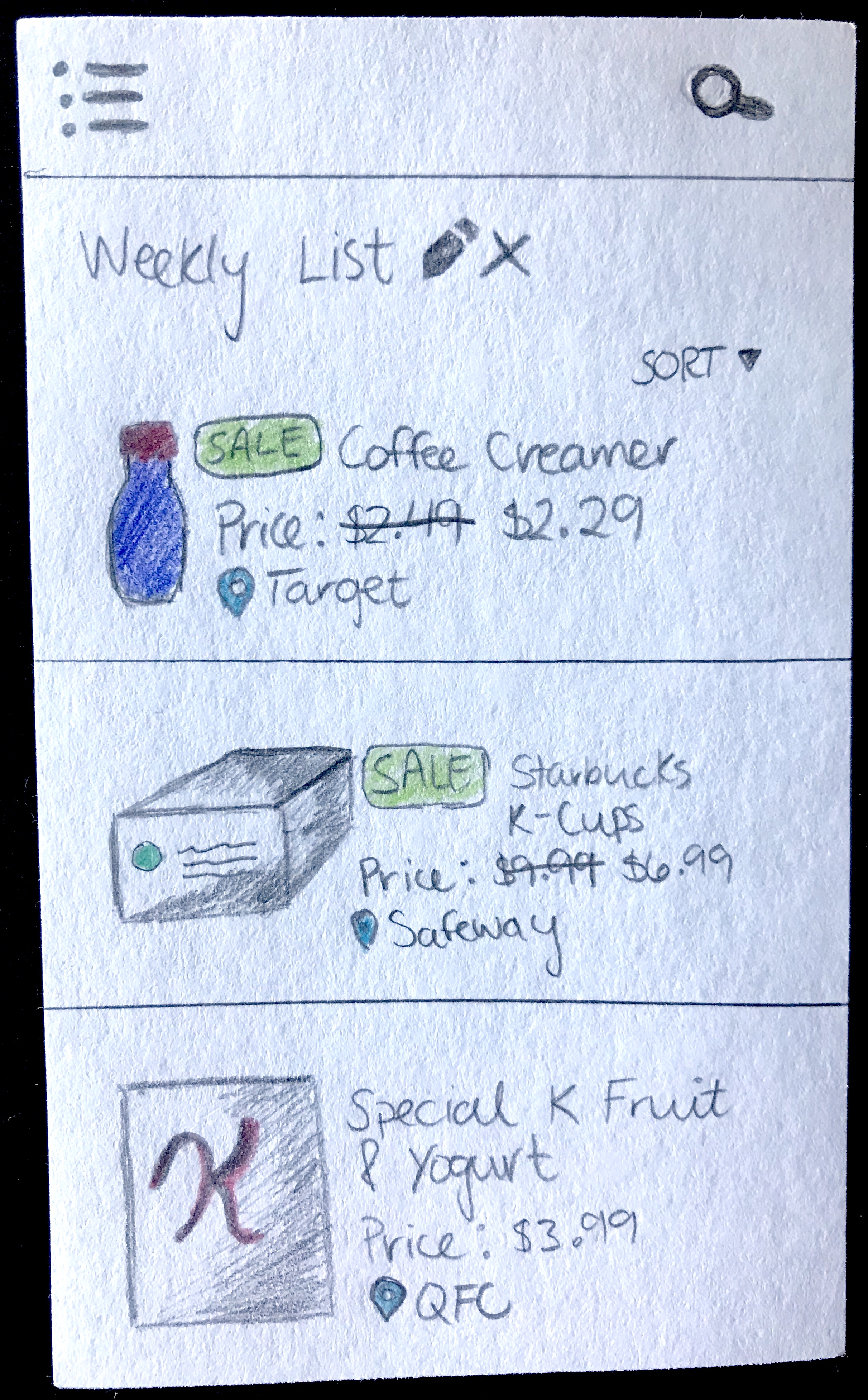
The very last task that our team tasked users with accomplishing was to view an item on one of their lists and tell us the lowest price for that item in the last 30 days. Navigating to the item itself was fairly straight forward for the users that we tested, however many felt overwhelmed when initially looking at the item page itself. Many users thought there were too many prices present on one screen and had a difficult time finding what they were looking for quickly. Despite this, the users still liked the breakdown in prices for each product.

Evaluation
What did we find out from usability testing?
After our first round of usability testing with six users, we received a lot of helpful feedback in improving the understanding of how to use our application as well as things we could change to strengthen user interactions to reduce confusion. We found out the following from testing our paper prototype:
Avoid the use of the word "ad" because it often has a negative connotation with pop-up ads or other non-welcoming elements that users want to avoid; some users suggested the word "deal"
The pencil and x icons were confusing; some users thought when they first saw the pencil icon that they could create new lists that way until they saw the green button at the top of the screen
Users thought an on-boarding process for new users might provide helpful for knowing why they need to choose what stores they shop at upon first login
The question mark below the signup form was confusing
Wireframes
With the feedback from our usability test at hand, we were able to reference it constantly as we created our wireframes to ensure that we were taking into account the frustration and confusion that our users experienced when they first used our application. We were able to make changes to the interface design and user experience of the product that our potential users will be interacting with.
Some of the changes we made included:
We changed all uses of the word "ad" to "deal" to make our app more inviting (seen on first screen, for example)
We removed the pencil and x icons and integrated editing and deleting as a swiping function into the user interface, which is something users are already used to doing in other applications.
Moved the question mark icon inside the password field as users tend to group elements together that are close by, providing the context that the question mark provides help with how strong a password is required to be (seen on third screen below).
Ideated ways to make the individual item pages less overwhelming
Sign Up/In Process
The login and sign up process is essentially the same in our wireframes as in the paper prototype to keep the flow simple (gradually filling in elements from top to bottom). Again, after logging in for the first time, the user will choose their favorite stores, as mentioned above, and will be redirected to their all of their lists (not pictured). Despite the feedback that it might be helpful to provide an on-boarding process for new users, we decided to disregard that suggestion because users interested in using Up Beet would already be aware of what the application is suppose to do while the users we tested were only shortly debriefed on our main concept, reducing time spent on the sign up process.
Grocery Lists
We also mocked up some more ways to make our application more interactive. One of those ways that we accomplished this was to add a module that shows up when a user clicks on the location marker under the item's price. This would allow users to see where that store is located, just in case they forgot or chose the wrong one initially, preventing users from shopping at the wrong store and missing out on money saving deals.
High-Fidelity Mockups
What was the reasoning behind our design decisions?
By now, all design decisions that we have made have been supported by usability testing and research into our target audience. Following the wireframes that we created, we created detailed, high-fidelity mockups that include the aforementioned feedback at every step of our design process.
Below are some of the final mockup screens (all screens can be seen in the final design specification) that we created along with a working prototype showing how a user could interact with our application if it were actually on a phone.
Sign Up Process & Navigation
When a user first opens our application, they are greeted with the splash screen that gives a brief description of Up Beet. Both the login and sign up screens have a large button near the bottom of the screen to confirm sign in or sign up, making it easy for the user to tap the button after they're done typing. Upon sign up, users will also choose the stores that they shop at most so the application can calculate item prices for where the user shops.
The hamburger menu contains all navigation links that the user needs while using Up Beet. We decided to use a hamburger menu because it allows users to access all links from every screen, but also because the other links are considered secondary. Grocery lists and the search are the most important elements since they are what aid a user when they're at the store so these are immediately visible upon opening the app (My Lists is the default screen and the search icon is always in the navigation header).
Grocery List
The My Lists feature allows users to create grocery lists with the ability to set reminders of when they should update the list again. The create a list button is very large and near the top of the screen in the final mockups, which eliminates the confusion users had previously of how exactly they could create a new list. By using a bright green color with larger font for the text, a user immediately knows that the My Lists screen is customizable according to their wants and needs.
We went with a swipe gesture for editing and deleting individual lists since it's a commonly used gesture that users already know. This gesture also makes it obvious which list the user is deleting or editing. The sort function also allows users to decide how they want their lists to appear, giving them the power to organize their lists any way they would like.
Individual Lists & Items
Each individual list is similar to the itemized view of a user's lists overall, except the user can see what items are added to each list. A check mark near the right hand side of the screen on the list view allows users to indicate whether they have gotten that item on their list already or not. By putting it on the right hand side of the screen, users can quickly scroll and tap to mark off items with just one hand. Blue is used to indicate that the item is on sale and the location of the item. By using the same colors, it shows the user that these two elements are related to each other.
On the item screen, we kept with a similar design seen in our paper prototype, but added buttons to display different information on the graph. This reduces the clutter seen in the initial versions and helps focus the user's attention on the graph since it takes up roughly half the screen. With different colors/shapes representing the different stores, the user can quickly see which store will have the best deal on the item.
We also added a favorite items list by default because one user during testing mentioned that she likes to track prices of certain items, but won't buy them unless they're on sale. We added in green arrows to indicate a price reduction and red arrows to indicate a price increase so users don't necessarily have to look at an item's price graph to determine it themselves.
Search
Up Beet also has a search feature, which is undeniably one of it's most important features because it allows users to search for items to add to one of their shopping lists. Items appear in an itemized list view, similar to grocery lists, so users can quickly scroll through, or choose to sort, the results until they find the item that they're looking for.
Nearby Locations
The location feature allows users to filter what stores will appear in their search results when adding items to their shopping lists and what stores show up in the weekly deals feature. If a user were to choose items to only appear if they are the cheapest, then users might see items from various stores in their search results whereas if they only allow items to appear from their favorite store, a user would only see results from Target for example. Clicking any map marker on the map enables a user to get directions to that store or set it as their favorite.
Weekly Deals
The weekly deals feature allows users to check the weekly ads of all grocery stores that match a user's location settings. Digitizing the ads gives users the ability to quickly scan the ads looking for deals that match what they're looking for that week or what might inspire their next meal. Users can skip over the big name brands often highlighted first in physical weekly ads and look for items via convenient sub-categories that will actually increase their savings for that week's grocery trip.
Settings & Notifications
The last feature that we added to Up Beet was the ability to turn on notifications for two different things: when an item goes on sale or when a user walks by an item on sale. We added this feature because some users that we tested our initial paper prototype with expressed the desire to know when an item is on sale without opening the application.
Each alert mode gives the user control over how their experience within Up Beet is tailored to their needs. By notifying the user when an item goes on sale, our application saves the user time and gives them the added convenience of not having to check a sales ad for weekly deals. Also, the alert mode of notifying a user of a sale when they walk by an item ensures that the user will not leave the store without essential items on any of their customized lists.
Final Product Video
To present our final product during our in-class presentation session, we also made a video to showcase our core features by showing a sample user scenario in which our application would be useful. The video follows a user named Sally who is always looking for the best deals on groceries and a way to keep organized, but sometimes needs that extra little bit of help to find the items in-store that she's looking for.
The final video can be seen below.
Future Development
We found that many potential users were very enthusiastic about Up Beet and loved how it combined many different aspects of currently used apps together into one powerful application. To take this project further, there are several aspects I would love to improve on and pursue:
Another round of usability testing with our high-fidelity mockups to see if there's any glaring problems in our intended user interactions.
Useful to test a high-fidelity prototype of our application in an actual grocery store to see if there's any problems users might encounter when they're not at home organizing their shopping trip
Overall, going through the design process of Up Beet was eye opening because we had to really emphasize with our target audience to understand what they would like to get out of a grocery helper application in order to use it in their daily lives. By listening to their ideas, we were able to incorporate some awesome features, like the alert mode and favorite items list, that we might not have thought of ourselves.